TFT View Design Basics
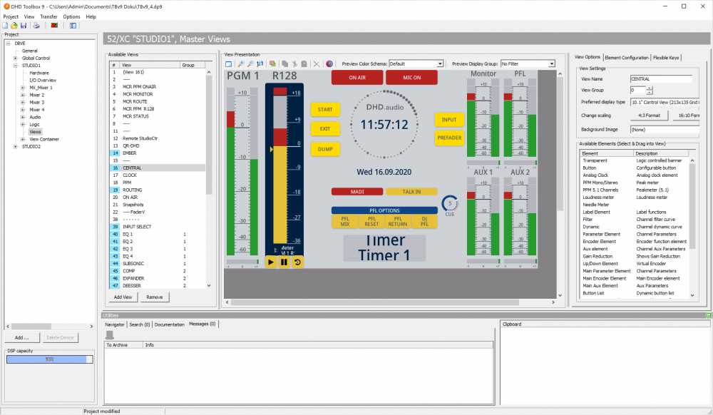
On the <device>/TFT Views page you define each TFT view that will be shown on a TFT display. You can decide what will be shown and how it will be shown for all elements in the view, as well as their size, color and arrangement.
You can create your views completely free and individual to completely fit all your needs. To create individual views, knowledge on Toolbox configuration is required.
Here you find the elements of view creation and some useful hints.
Important
Because of different rendering algorithms display preview in the Toolbox Software and actual TFT views on device can differ slightly. Make sure to check your views on the device before using them in a productive environment.
Using the View Editor
All elements which you can use in the view are shown in the Available Elements list. You can drag elements from this list to the display preview View Presentation. The element is only dropped if it is completely located on the display preview. As long as it is not, the element is not shown.
To remove any element, select it and click the  -icon above the display preview area or press the
 Del (Entf) button on your keyboard.
Elements can be moved in the display preview area with a left-click and hold on the element and moving the the mouse.
Elements can be changed in size in the lower right corner. If you left-click and hold on this area, you can change the size of the object by moving the mouse.
The size, Z-Position and position of all elements can be adjusted on the Element Configuration Tab. Position-X and Position-Y are always related to upper left corner. Width and Height always add or reduce size on the left and bottom side. With Top, Up, Down and Bottom you can navigate the element on the Z-axis.
Above the display preview, you find three zoom buttons to enlarge or reduce the size of the preview and to scale it to its original size. These settings are for a better clarity of the configuration process only, they do not affect the view on the TFT display.
Use  to undock the view editor. This way you can move the view editor to a second screen.
With Preview Color Scheme and Preview Display Group you can see how your view will look in a different color scheme or with a Display Group Filter enabled.
Use  to enable Z-level selection. If two or more elements overlay, clicking on them will always select the element on the top. By right-clicking on an element in the Z-level selection mode, you can see which elements overlay and select an element from the background. You can use
 Ctrl and left-click (or right-click for elements in the background) to select or deselect several items. Shift and left-click selects all elements of the same type, e.g. all buttons or all label elements. Clicking Ctrl and Shift simultaneously allows you to select or deselect all elements of several types.
Toolbox version 9.1.3 and above: right-clicking on elements will always show you a list of all elements on that position, even when you are not in Z-level selection mode. When you have an element in the background selected, you can not directly select the element on the top. You need to deselect the item in the background first. This makes dealing with elements in the background easier.
Cut, Copy and Paste
To cut, copy and paste any view element, select the element you want and click above the display preview:
 to copy all selected elements.
 to cut all selected elements.
 to paste all selected elements.
Tip
Cut, Copy and Paste work globally between all views in the same toolbox project. You can use it to copy elements between devices or simply from view to another view. You can't copy something from a Master View or Central View container into a Fader View Container or vice versa.
Shortcuts
To select multiple elements, hold Ctrl (Strg) key pressed and left-click on any element you want to select.
To resize an element, select it and hold Shift (⇑) key. Use the arrow-keys (← ↑ → ↓) to resize it stepwise. You can use this function with multiple elements selected.
To move an element, select it and hold Ctrl (Strg). Use the arrow-keys (← ↑ → ↓) to move it. You can use this function with multiple elements selected.
Click Order (RX2 only)
With the  button on top of the page you can define in which order you want to control encoders on the TFT by using the main control encoder on the RX2 central module.
To set up or a click order:
- click the button on top of
View PresentationArea - in the confirmation window click
Yesto setup a new clickorder - Encoder elements will be marked as a red circle. Click them in their designated click order
- Click the red circle again to remove them from click order and assign them again
- Leave encoder elements blank (
-within the red circle) if you don't want them to be in the click order - Click the button on top of
View PresentationArea again to save click order
To reset a click order and setup again:
- click the button on top of
View PresentationArea - in the confirmation window click
Yesto setup a new clickorder. This will delete the old settings and you can start over - Click the button on top of
View PresentationArea again to save click order
To view a defined click order:
- click the button on top of
View PresentationArea - in the confirmation window click
Noto view an existing clickorder - Click the button on top of
View PresentationArea again to leave click order view
Design Basics
With Toolbox you can design individual views for many purposes. But creating many views is a lot of work. Using custom colors and color schemes as well as copying and pasting elements from view to view can save you a lot of time. Also switching between views should follow some rules to keep it simple.
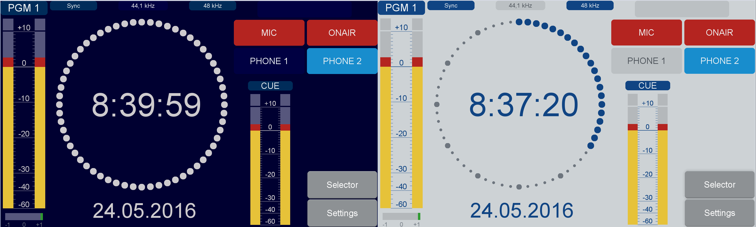
Using Color Schemes
In the project tree, on the General page, select the Colors tab. There you can create up to 4 color schemes in addition to the default colors. Each color scheme can contain up to 60 colors.
You can preview the different color schemes in the view editor. Above the display preview area you find a Preview Color Schema dropdown menu.
The first 11 colors of every scheme are always locked for system reference purposes. If you want to use one of these locked colors, we recommend creating a new color with the same value. This is useful to manipulate element colors centrally for a certain element type. Also it is useful if different color schemes (e.g. like a dark-scheme for night) are planned.
For changing the background color, change the color with the name Background. For more information on Colors page, see Colors.
Fonts
Fonts can be adjusted when selecting the General page in the project tree and there, select the Fonts tab. Here, new fonts can be created. Views can use the created fonts, but bold or italic values will be ignored. Only the font-size is relevant.
First 13 Fonts are fixed for system reference purposes. When using a specific font size for a specific group of elements, you can create a new font with another or the same size. In case of changing the size, you only have to adjust the font size of the created font on General page, Fonts tab and not on every single element. Also font-sizes differing from default values are possible.
Switching between Views
Switching between views can always be realized using TFT Buttons or hardware keys with Key Function Show View. For fader views the Key Function Show Fader View works.
Switching between Master Views
Switching between Master Views is easily done with TFT buttons or hardware keys and the key function Show View. To realize a simple menu, you can use multiple buttons with this function and copy them from page to page. If the current page is the page defined in a Show View key, the Key will be enlighted with the On color.
The Set Default View key function can manipulate a default view on a selected Central Display Group.
Tip
For having a user friendly experience, make sure the current page name is displayed on every page and there is always a button to exit the current view and/or return to Main View.
Access Views
Access Views are only accessible if access is active. You can jump between access views using Show View keys with Follow Access active.
More information on Access Views.
Tip
If Follow Access is active, the key will only work if access is active. To call pages without access active, you can use the key function Show View and configure a page for both cases.
Switching between Fader Views
Switching between Fader Views is easily done with TFT buttons or hardware keys and the key function Show Fader View. You can define the fader to act on and the view to set. Fader Views have no access views.
More information on Fader Views.
Tip
To manipulate more than one Fader View use the key function Set Channel Views. Here you can define a range of channels you want to set. If range start or end is (None), the view will set to all faders.
This function is e.g. useful for resetting all fader views to default view on bigger consoles.