View Elements & Configuration
On the <device>/TFT Views page, create or select any element and go to the Element Configuration tab. Here you can edit all properties of the selected element. Also multiple elements of the same type can be edited.
General Settings
The following settings appear on one or more TFT elements.
The Element Info area shows unique information about the element.
Typeshows element type and ID. Syntax: <Type> (ID<X>).Grid Infoshows alignment and size of the element.
The Layout Settings area allows to set the X-, Y- and Z-Position, measured from top left corner and width and height valued. Changing Width will always add or subtract on the right side, changing height will add or subtract on the bottom.
Topallows to bring selected elements to the very top. Useful to sort overlapping elements.Upbrings selected elements one Z level towards the top.Downbrings selected elements one Z level towards bottom.Bottomallows to bring selected elements to the very bottom. Useful to sort overlapping elements.
Tip
For most TFT elements, custom colors can be used and defined. Color schemes can also be applied. For global color settings, see Colors Page.
Visibility Condition
The option Visibility Condition allows you to hide elements if a logic is false/off and show them if the logic becomes true/on. If the visibility condition is false, the element will also not be touch sensitive or take any space. Also, the element can not serve as logic source if it is not visible.
Display Group Filter | minimum Toolbox version 9.1.2
Requires minimum Toolboix v9.1.2 / FW v9.1.4
With Enable Display Group Filter you can hide an element on some display groups while showing it on another. You can select a display group of a TFT in the Console tab. The Hide All/Show All buttons make selecting/deselecting all checkmarks easier.
Elements
The following display and operating elements are available for configuring TFT views.
Transparent
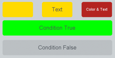
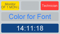
A Transparent is a transparent box that can contain a name/text. The color can change depending on a selected condition. If the selected condition becomes true, the defined color will be used. If the condition is false, the transparent will be transparent.
On Indication area:
Text: Enter the text you want the transparent to show. May also be left blank. Maximum of 125 characters (UTF-8) are possible. If you use other characters than ASCII, it may be less.- Select a logic condition: In
Conditionfield, clickselect.
On Appearance area:
- Select the color you want. You can define any color on Colors Page.
- Instead of the background color, the font color can be defined (select the Use color for text check box).
- The font size can be adjusted. See more Fonts.
- With
Vertical/Horizontal Text Positionyou can change the text alignment within the transparent. - Use
Auto Scroll Textif text is longer than element width can display.
Note
Since Toolbox version 9.0.4 you can directly drag and drop a logic source from the Logic Sources tree into your view. Toolbox will create a transparent with the selected logic source assigned.
Example
By linking a transparent with a fader start logic function, the field shows whether the fader is open or not.
Note
There must always be a condition selected to display a color. (Not Assigned) means the transparent state is false. To have its state always true (color active), we recommend selecting Device Running as condition.
Button
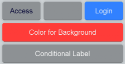
Because all DHD TFT displays are touch sensitive, you can configure buttons that can be used like keys on a console. Instead of the font color, the background color can be defined (select the Use color for text check box). The font size can also be adjusted.
Tip
A button can have any key function. For a full list of all key functions, see Console.
Buttons can have a user defined function. That allows to trigger e.g. logic functions or to indicate different behaviours.
Buttons can be set to Momentary,Toggle or Timed Toggle:
Momentarybuttons are active as long as you keep pushing them.Togglealways engages the button.Timed Toggle: When you tap the button short, the button engages. When you tap the button again short, it disengages. When you tap the button longer, it is only engaged as long as pressed.
User Defined Buttons can have up to 5 conditional colors and up to 10 conditional labels.
The Lamp Source or Condition Source can be any logic source available in logic tree. Condition priorities are sorted as in output functions. The highest priority has to be on top, the lowest on bottom of the list.
(not assigned) has no function and can never become true. You can have a default color if no condition is true: use Device Running as logic source and sort it to the bottom of your condition list. If no conditional label is true, the defined text value is displayed.
The button can only be used to display logic states. Activate Display Only to disable tapping the button. This also disables the shadow of the Button, it looks like a Label Element.
With Vertical/Horizontal Text Position you can change the text alignment within the button.
Auto Scroll Text scrolls the text if it is longer than element width can display.
Act on Hidden Layer is meant for key functions to work on channels in the non-active layer. Works only between layer A and layer B.
If you enable Hide when disabled, the button will only show if it has an operating function. For example if you have a key function for stereo channels (such as Mono -3dB, LL, RR etc.) assigned to a button on your fader views, the button will only appear on stereo channels, not on mono channels.
Analog Clock
Dark Blue
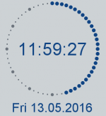
Analog clock is an analog and digital time display. The abbreviations of the weekdays shown by the clock element can be changed in Weekday abbreviations in View Clock Format area. A time offset of +/- 12 hours can be set in Time/Date Options Area.
Tip
If you do not have enough space on your TFT view for an analog clock element, you can use a label element to display current time.
Since Toolbox version 9.1.0 you can choose between different clock layouts, configure seperate colors for text and active/inactive dots and hide certain text elements (e.g. seconds, weekday name…)
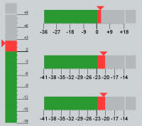
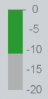
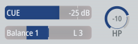
PPM Mono/Stereo
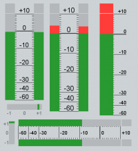
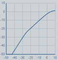
The PPM Mono/Stereo element is a level meter for mono and stereo signals and correlation level meter. The source of a PPM can be a level detect (See also Level Detection) or a defined Channel / Fader. It can also work on Access. The scale colour can be adapted.
If the width is bigger than the height, the element will be rotated 90 degrees automatically.
The PPM Element brings also a correlation detect, if activated. Correlation detect works only if a level detect is assigned.
Available scale types:
- German PPM (-60 dB to +10 dB)
- IEC IIa BBC PPM (1 to 7)
- Nordic (-42 dB to +12 dB)
- EBU-digital (-36 dB to 0 dB)
- North American VU (-20 dB to +3 dB)
- Digital 0…60 dB (-60 dB to 0 dB)
- ARD (-60dB to +9dB)
- Digital True Peak (-60dB to +3dB)
Above a certain value the bar graph changes its color from green to red. This threshold is adjustable between -30 dB and +30 dB (default = 0 dB).
An offset can be configured for the scale (-30 dB to +30 dB, default = 0 dB).
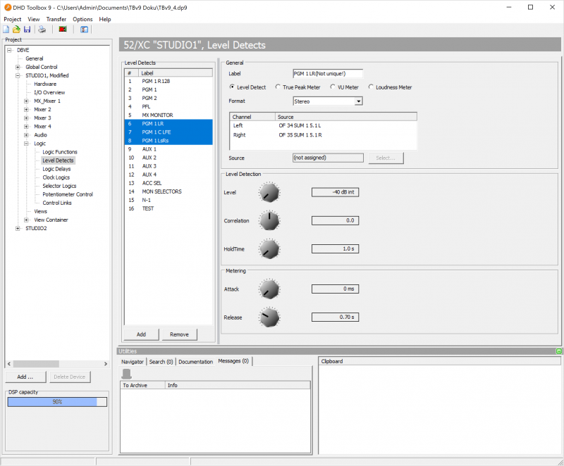
You can set the properties of the peak program meters of the TFT displays with the aid of Toolbox. In the project tree, select <Device>/<Mixer>/Logic/Level Detects and select the desired Level Detect.
Please enter the following values to emulate an analog peak program meter with an integration time of 10 ms, according to the standards DIN 45406 and IEC 268-10 (PPM, Type I), respectively:
- Attack = 2 ms
- Release = 0.7 s
Please use the following values to emulate a digital peak program meter:
- Attack = 0 ms (or 1 ms if integration time is required)
- Release = 0.7 s
Note
For more Information on Level Detection, see Level Detects and Level Adjust pages.
Minimum Toolbox v9.1.4 & FW v9.1.8: The fader channel related meter source of the peak meter can be defined for each peak meter (Input, Pre Fader, Post Fader).
By using (Default) the peak meter will set the meter source that is globally defined by the Set Meter Source key function.
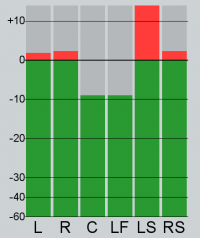
PPM 5.1 Channels
The 5.1 PPM shows 5.1 signals as single meters for each channel in one graph. The 5.1 PPM can be applied to 5.1 channels with Multi Channel Source or to three stereo level detects.
The sources of the level detects are L/R, C/LFE and LS/RS. Please note, that the center and LFE signals are handled as a stereo pair internally. This way, the center and LFE levels can be shown with one PPM. The left signal is always center and the right signal is LFE.
The Level Detects must exist in the order L/R, C/LFE, Ls/Rs in a row on the <Device>/Logic/Level Detects page. Otherwise 5.1 PPM will use the wrong data sources.
In the Edit window you can just select the first data source (Level Detect L/R). The peak meter will then use automatically the following two stereo level detects.
Tip
See 5.1 Surround Configuration for more information.
Minimum Toolbox v9.1.4 & FW v9.1.8: The fader channel related meter source of the peak meter can be defined for each peak meter (Input, Pre Fader, Post Fader).
By using (Default) the peak meter will set the meter source that is globally defined by the Set Meter Source key function.
Loudness Meter
The Loudness Meter element provides a loudness meter for mono and stereo signals.
Available scale types:
- EBU+18 LU
- EBU+9 LU
- EBU-5 LUFS
- EBU-14 LUFS
Top Range can have values -30…30 LU.
The Loudness Meter element contains only the bar (incl. peak display and short value arrow)
- short value is graphically shown as a small triangle on the left side
- true peak display on top of the meter bar (oversampled x4, -1dBFS)
- if required, Momentary, Short, Integrated, Loudnes Range values (M, S, I, LRA) can be added as extra Label Elements - size, label and colour can be customized
- start, stop and reset are available as key function, gating (triggered by external sources) can be realised via virtual keys.
- The Main Bar function can be configured as
Momentary(standard value) orShort - The Triangle function can be configured as
Short(standard value),MomentaryorOff
Note
For more Information on Level Detection, see Level Detects and Level Adjust pages.
Important
- The license 52-8581 Enhanced DSP Processing is necessary for all DSP cores.
- 52/XS2 and 52/XS cores additionally require the license 52-1950 XS Core extended feature upgrade to be able to configure the function and the TFT views.
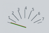
Needle Meter
Scale Type can be configured to show BBC PPM, a classical Dual Needle PPM, or VU Meter.
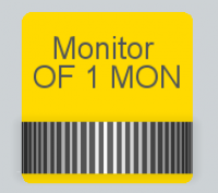
Label Element
The Label Element can be used in various functions (preset is (None)). Either the font colour or the background colour can be defined (select the Use color for Background check box). The font size can also be adjusted. With Vertical/Horizontal Text Position you can change the text alignment within the label element. Use Auto Scroll Text if text is longer than element width can display.
| Function | Description |
|---|---|
Channel Name | Shows the channel name. |
Clock | Digital time display. |
Channel Timer | Shows the channel timer. (Active, when fader start on, reset when fader stop) |
Timer | Shows one of the central timers (timer 1 to 6) |
OVL Err (Overload / Error) | Overload is shown, if an analog input has to much level. |
Error is shown, if no valid signal is connected to a digital input |
|
Last loaded ChSnap | Shows the number and the name of the channel snapshot that was loaded last. |
Last loaded MxSnap | Shows the number and the name of the mixer snapshot that was loaded last. |
Limiter active | This function is active, if the limiter reduces the gain. |
Orig. Ch. Name | Shows the original fader channel name. Useful if channel was renamed. |
Hidden Layer Ch. Name | Shows the Name of the channel assigned on the non-visible Layer (Only B-Layer / A-Layer). |
Hidden Layer OVL Error | Shows the overload state of the channel assigned on the non-visible Layer (Only B-Layer / A-Layer). |
Selector | Shows the current state of a selector. |
Selector (Shift Allowed) | Shows the current state of a selector with shift allowed. |
Delay | Shows the delay state and value of a fixed processing delay. |
LoggedInUser | Shows the current logged in user. |
Loudness Meter Momentary | Shows momentary value of selected Loudness level detect. |
Loudness Meter Short | Shows short value of selected Loudness level detect. |
Loudness Meter Integrated | Shows integrated value of selected Loudness level detect. |
Loudness Meter Range | Shows timed value of selected Loudness level detect. Can be controlled via Button functions Loudness Metering/Start…Stop…Reset. |
Loudness Meter Max. Momentary | Shows maximum momentary value of selected Loudness level detect. |
Loudness Meter Max. Short | Shows maximum short value of selected Loudness level detect. |
Loudness Max. True Peak | Shows true peak value of selected Loudness level detect. |
Profanity Delay State (sec) | Shows the current fill state of the Profanity Delay in xx.x seconds. |
Profanity Delay Max. Delay (sec) | Shows the maximum currently available Profanitiy Delay time in xx.x seconds. |
Filter Element
With touch EQ functionality
Note
Touch EQ functionality is supported by the following TFT displays: 52-4010, 52-4510, 52-4018
It is also supported by TFTs built into the following devices: 52-1156, 52-1114 and by 52-8511 Views App Web (all versons) and Views App Windows V7.0.28 and newer.

The Filter element is the container for the Touch EQ functionality. This function implements an overlay to edit filter curves in an easy and intuitive way by dragging.
Existing Filter elements will be automatically updated.
The Touch EQ overlay can be opened by double tapping on the filter element. On the upper left, the name of the selected channel is displayed. On the upper right, the on/off state of the DSP Functions is displayed and can be changed by tapping the  icon. DSP Functions that can be edited in Touch EQ functionality are:
 SubSonic, EQ 1-4, VarFilter 1 (Filter 1 on device), VarFilter 2 (Filter 2 on device). See Channel Assignment / Fader Configuration for more information on configuring DSP Functions. If a DSP Function is not used in a channel in Toolbox, it will not be displayed. The EQ 1-4 Functions can be enabled globally on the EQ entry.
To select a DSP Function, tap the circle  icon of the filter curve. In the upper left, all parameter values of the DSP Function are displayed. In the lower section, additional information and options are given.
- Change the
FrequencyandGainby dragging the circle within the grid. - Change the
Quality/Qparameter by pinching with your fingers while holding the circle icon or by using the
 Qslider in the lower section - Change the
Typesetting by tapping the following icons on the lower section: icon: High Pass (VarFilter)
 icon: Low Pass (VarFilter)
 icon: Band Pass (EQ 1-4)
 icon: Notch (EQ 1-4)
 icon: High Shelving (EQ 1-4)
 icon: Low Shelving (EQ 1-4)
- SubSonic / VarFilters: switch the DSP Function on/off by tapping the concurring
 icon in the upper / lower section or by double tapping the circle icon.
 - EQ 1-4: Globally switch all eq DSP Functions on/off by tapping the concurring icon in the upper section. Swicht every single EQ Band (1-4) on/off by double tapping the circle icon or by tapping the icon in the lower section.


Important
When using the Touch EQ functionality and enabling/disabling single EQ Bands, snapshots will be modified in a way that they are not downward compatible with older firmware versions without Touch EQ functionality. This can be important for users of snapshot manager software or firmware downgrades.
To close the Touch EQ overlay, tap the X button in the upper right corner or tap on a margin of the overlay.
Single DSP Functions (EQ 1-4, SubSonic, Filter 1, Filter 2) can be disabled by setting the element color to off. The function can still be controlled, it is only visually hidden on the specific filter element.
The whole Touch EQ functionality can be disabled when setting the grid color to Off.
The Filter element can be run in two display modes: Display Only or Default mode. In Default mode, the Touch EQ functionality will be applied to the element directly on the element, the overlay can also be opened on double tap. For smaller filter elements, this can be confusing. You can activate Display Only mode to hide the touch points on the preview element and still open the overlay on double tap. Check Display Only, if you want the element to behave this way.
The Overlay can be disabled to avoid accidental operation using the Enable Overlay Mode Checkbox. Uncheck Enable Overlay Mode to disable the overlay. This will not affect the Display Only mode settings. It can be useful for access pages when no overlay is required but touch functionality is useful.
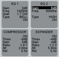
Dynamic
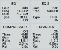
Graph for showing the dynamic ratio parameters. Monitors Compressor, Limiter and Expander.
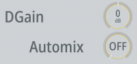
Parameter Element
The Parameter Element shows certain parameters of a selected DSP function. The parameters are displayed only. Color option always changes font color.
Possible Functions:
- EQ1…4
- Subsonic
- Limiter
- Noise Gate
- Compressor
- Expander
- DeEsser
- DeEsser2
- AGC
- VarFilter 1/2
- Gain
- Pan/Bal
- Delay
- Stereo Width
- Loudness AGC
- Automix
- 5.1 Pan/Bal
- 5.1 Surround
- 5.2 Misc.
- CF Out
- CF In
- DGain/AGain/PanBal
Encoder Element
Encoder Element is for controlling DSP functions on a TFT (except AUX functions). Additionally, a hardware rotary controller can be assigned via Control By selection.
Note
In fader containers a maximum of 10 encoder elements is possible.
Possible DSP functions:
- EQ 1…4
- SubSonic
- Limiter
- Noise Gate
- Compressor
- Expander
- DeEsser
- DeEsser2
- AGC
- Var. Filter1
- Var. Filter2
- Gain
- Pan/Bal
- Delay
- Stereo Width
- Loudness AGC
- 5.1 Pan/Bal
- 5.1 Surround
- 5.1 Misc
- CF Out
- CF In
- DGain/AGain/PanBal
A sub-function can be selected that is set by default. Additionally, you can lock the preselected sub-function or you can hide all other sub-functions to show only the selected sub-function. In both cases it is not possible to swap to another sub-function.
You can choose between slider and knob.
The color can be changed. If a hardware rotary controller is assigned, the color assignment will be ignored and the color of the hardware rotary controller will be used automatically.
The Encoder Element can act on a Fader/Layer, a Channel or on access.
The Encoder Element supports line breaks by using \ (backslash) for example in a cleanfeed selector source list.
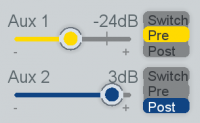
Aux Element
Aux Element is used to set the level of an aux send. It can be controlled by a hardware potentiometer / encoder. It can be assigned to a fader/channel or work with access.
A sub-function can be selected that is set by default. Additionally, you can lock the preselected sub-function.
Gain Reduction
Gain Reduction element shows the gain reduction caused by the compressor, limiter, gate, deesser, expander and/or (loudness) AGC. It can also be useful to monitor any automix activities.
- Select the Compressor check box to show the gain reduction caused by the compressor.
- Select the Limiter check box to show the gain reduction caused by the limiter.
- Select the Expander check box to show the gain reduction caused by the expander.
- Select the Automix check box to show the gain reduction caused by the automix.
- Select the Gate check box to show the gain reduction caused by the noise gate.
- Select the DeEsser check box to show the gain reduction caused by the deesser (only DeEsser 1 or DeEsser 2 can be displayed at the same time).
- Select the AGC/ Loudness AGC check box to show the gain reduction caused by the (loudness) AGC.
- It is possible to select multiple check boxes to show the sum of the gain reduction of some or all functions.
Note
Make sure to define acting with access or on a specific fader / channel!
Up/Down Element
The Up/Down Element is the TFT equivalent to the rotary pulse encoder on a console.
It can be used:
- As a rotary selector
- As potentiometer control
- To edit a delay in a fixed processing
- To set a timer
- To select in a talkback list.
Important
The element is deprecated and exists for compatibility reasons. We recommend using Encoder Element or Pot. Slider instead.
Main Parameter Element
The Main Parameter Element shows certain parameters of a selected DSP function. Color option always changes font color.
The Main Parameter Element is a button. When pressing, the parameter settings are assigned to a main encoder element, thats set to Follow Menu.
Possible Functions:
- EQ1…4
- Subsonic
- Limiter
- Noise Gate
- Compressor
- Expander
- DeEsser
- DeEsser2
- AGC
- VarFilter 1/2
- Gain
- Pan/Bal
- Delay
- Stereo Width
- Loudness AGC
- Automix
- 5.1 Pan/Bal
- 5.1 Surround
- 5.2 Misc.
- CF Out
- CF In
- DGain/AGain/PanBal
Main Encoder Element
On new TFTs, Main Encoder Element has no practical function and differs only slightly from the normal Encoder Element. On old TFTs, it allows assigning a function to a Hardware Encoder or Up/Down Element.
Important
This element exists mostly for compatibility purposes on projects made with older Toolbox versions or working with older TFTs. Use Encoder Element instead.
Main Aux Element
On new TFTs, Main Encoder Aux has no practical function and differs only slightly from the normal Aux Element. On old TFTs, it allows assigning a function to a Hardware Encoder or Up/Down Element.
Important
This element exists mostly for compatibility purposes on projects made with older Toolbox versions or working with older TFTs. Use Aux Element instead.
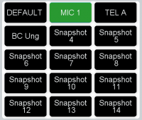
Button List
The Button List 2015 allows to display all selectable values for an action. A Button List can have a maximum of 250 pages.
The selectable functions are:
Note
The Button List can only display a maximum of 100 buttons per page.
Input Select
Select from all possible inputs in the same pool for a defined channel (on access or channel/fader). Input selection is directly active, no button list controls for loading/saving/renaming are needed. Only Prev. Page and Next Page controls are required.
The Input selection has an on air protection: if the Fader Start is on, the channel input can not be set. To ignore on air protection, activate Force option.
If an input is already in use, it will be marked and can not be used again. All inputs can only be active on one channel. To quickly change channel sorting, activate Reassign option. When you select a channel, it will now move to the new Fader. On the old position, a blank channel strip will be created.
Important
DHD does not recommend having empty channels on your console. If required, create channels without input patching on <Device>/<Mixer>/Fader Channels and use them on unused channel strips.
Renaming an input is done with key function TFT Functions/Show Keyboard and Function Edit channel label.
Monitor Select
Select from the options you defined in a selector. You need to create and select a Selector with a Selector Source List.
Allow Shift can be used in combination with key function Monitor Functions/Monitor Bus Shift. Set an offset there to shift up to another selector (See the selector IDs for correct value). The selector shifted to must have a Selector Source List.
To prevent the selector from being switched off, select Deny Switch OFF. This is useful when Allow Shift is used.
Load/Save Snap
Load a mixer snapshot. If a channel is selected or access pressed, a channel snapshot can be loaded.
Load/Save Fixed Processing
Load a Fixed Processing Snapshot.
Remote Functions
These functions will be used together with the DHDOM/DHDOS and need additional configuration in that software.
Load/Save Remote Snap: Load a server snapshot stored on operation server. Can be a channel or a mixer snapshot. See Operation Manager / Snapshot Manager documentation for more information on snapshot management.Remote Routing: Perform a remote routing. See Operation Manager / Remote Routing documentation for more information. TheRouting List Addr Xis the list address you define in OM.
Routing Input
Select a Selector Source List as list for possible routing inputs. This function can be used in combination with the Routing output function on a key. It is useful if you have a bigger amount of routing inputs and don't want to add all with a separate key but use a button list to display all possible.
CF Out Select
Activates the output selector instead of the clean feed as outgoing signal if a fader channel with enabled clean feed is routed to the fader. (See Fader Channels – Configuring Signal Sources) This function works only if a Output Selector Source List was assigned to the clean feed under <Device>/<Mixer>/Mixing Functions. In the assigned Output Selector Source List, at least one signal must be listed
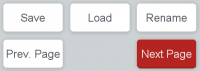
Button List 2015 Control
Control buttons for Button List 2015. Select the Button List, you want to control. Then select the function.
Possible functions are:
Rename Snapshot: Rename an existing snapshot. Only useful for Button lists with snapshot functions.Load Snapshot: Load an existing snapshot. Only useful for Button lists with snapshot functions.Save Snapshot: Save an existing snapshot. Only useful for Button lists with snapshot functions.Next Page: Switch Button list to next page.Previous Page: Switch Button list to previous page.Select Page: Switch Button list to defined page (max. 250 Pages).
Display Button
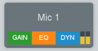
Display Button is a button with display. Can be used to set access on defined channel. The Display Button gives an overview of the active DSP Processing state.
| Function | Description |
|---|---|
| Slot Nr. | Set the fader number on which the button should work. |
| Set Acess View | When checked, pressing the button will set access for the assigned Slot Nr. (channel) |
Fader
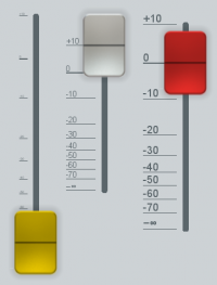
Fader elements can be used to control assigned channels. They have the same properties as hardware faders. If a software and a hardware fader are assigned to a channel, the fader values will be synchronized. On Fader modules without motor faders, the displays will show arrows if the state is changed on the TFT Fader.
You can adjust the color of the fader. If the scaling is not visible, you must make the width of the fader element bigger.
The fader can be assigned on Faders/Layers, directly on channels or work with access.
This element can be useful for controlling bus volumes or volumes of channels where direct access is not necessary.
| Option or subfunction | Selection | Description |
|---|---|---|
| Color | Choose the designated color of the fader knob | |
| Double Tap Knob | Disabled | No double tap functionality |
| Fader On/Off | Toggle between 0 dB and off position. If fader level is above fader start value, the fader will toggle to off position. If fader level is below fader start value, it will toggle to 0 dB. | |
| Set to 0 dB | Set Fader level to 0 dB. | |
| Double Tap Scale: Set Fader Value | When checked, double tapping on a scale position will set the fader value to the tapped position. | |
| Act.. | on Fader | Assign fader to a fixed console fader & layer. |
| on Channel | Assign fader on a fixed fader channel. Will only work if fader channel is assigned to the console. | |
| with Access | Fader will get and set the value of the channel currently selected. If no channel is selected fader will be without function. | |
| Extended | Soft Pots | Assign fader to control a fixed Software Potentiometer. See Audio / Potentiometers. |
Pot. Slider
The Pot. Slider element allows you to control or display various encoder / potentiometer states. The color can be changed.
Fine Controlmakes the scaling and control behaviour more precise, you can control now in 0.1 dB steps. Without this option, the control is set to 1 dB Steps.Hide Labelhides the label text, you entered in theCommon/Textfield.Hide Valuehides the value of the element.- Also you can decide between
SliderandKnoblayout.
You can control system potentiometers and software potentiometers. You can also control faders on layers.
You can only display channel fader values and hardware encoder / potentiometer values. Toolbox will notify you if your selected encoder / potentiometer is display only.
The Pot. Slider Element supports line breaks by using \ (backslash) in potentiometer names.
Picture

Picture elements can be any image file (file type PNG) matching system recommendations. To define pictures in your configuration, see Resource Files.
Make sure to have your pictures set on an accurate resolution when importing the resource files.
For placing pictures:
- Drag a
PictureElement from theView Options/Available Elementslist to the view. The element will be empty. - Go to
Element Configurationtab. OnAppearancearea, select the image needed image, defined in the resource files. - Check
Maintain Aspect Ratioto maintain aspect ratio. When checked:- With
Horizontal PositionandVertical Positionyou can decide how the image will be aligned when the picture container does not have the correct width and/or height in relation to the resource file.
Tip
Toolbox can maintain and use transparency with PNG files.
Container
See View Container.
Fixed Proc Element
This element allows you to change settings of fixed processing.
Possible Functions:
- EQ1…4
- Subsonic
- Limiter
- T-Lim
- Noise Gate
- Compressor
- Expander
- DeEsser
- DeEsser2
- AGC
- VarFilter 1/2
- Delay
- Loudness AGC
- Sine
- Enhancer
- DGain
- PDelay
Fixed Proc Filter
Fixed Processing filters work according to Filter elements but in Fixed Processing context.
Fixed Proc Dynamic
Fixed Processing dynamics work according to Dynamic but in Fixed Processing context.
Mixer Parameter Control
Mixer Parameter Control allows you to change parameters (for example Automix parameters) of a whole mixer.
| Option or subfunction | Selection | Description |
|---|---|---|
| Control By | Choose a physical encoder on your console to control these settings. | |
| Act on Mixer | Mixer 1…4 | Choose which mixer your parameter control acts on. |
| DSPFunction | Automix | Assigns Automix Function to the parameter control. |
| Default Menu | Defines which Main Parameter is default. | |
| Disable Menu | Selects menus you want to hide. | |
| Lock Menu | Disables toggling between menu by pressing the encoder. |